Data exists throughout the entire digital realm of the present time. Every day business entities as well as researchers and organizations accumulate enormous data sets.
Table of Contents
ToggleData itself provides no engagement capabilities and no capability to drive decisions. Data transformation into an interesting narrative delivers substantial changes in effectiveness.
The ability to tell stories using data improves both audience engagement no matter what your position is in marketing analysis or business management.
The following post explains user engagement elevation methods for data storytelling alongside methods to heighten the impact of your quantitative findings.
What is Data Storytelling?
The procedure of data storytelling involves developing insights from data results into relatable stories through visual elements which include contextual information.

It involves three main components:
- Data: All good stories need well-organized and precise data as their base structure.
- Narrative: Narrative refers to an easy-to-understand plot that illustrates the information extracted from data.
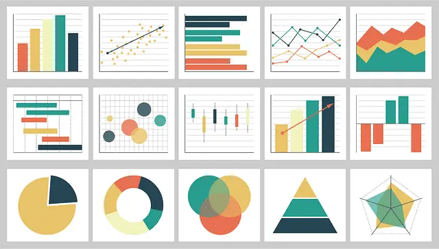
- Visuals: The graphs along with infographics and charts simplify advanced information for better understanding.
For success in data storytelling, one must display numbers while sharing messages that speak directly to listeners.
Why is Data Storytelling Important for User Engagement?
Numerical data that appears alongside tables presents itself as unengaging content to readers.
An expertly designed data story has these main properties:
- Complex information requires presentation as easy-to-understand material.
- Improve audience retention and recall.
- Decision making becomes more effective through the presentation of essential findings.
- Build emotional relationships with the people you address.
- The data maintains higher credibility combined with better trustworthiness through these measures.
You may also read: What are common Visual Big Data Analysis Technique
The amount of engagement grows higher when users interpret data as meaningful, present it in pleasing visuals and discover ways to put it to work.
How to Improve User Engagement with Data Storytelling
1. Know Your Audience
You must first identify your target audience before starting your data story creation process.
Ask yourself:
- How proficient do recipients of data content remain regarding data inspection?
- The audience faces which types of issues?
- How should viewers act following their exposure to the data information?
The presentation requirements differ between executives who need condensed summaries and data analysts who need further detailed information. Tailor your storytelling approach accordingly.
2. Focus on a Clear Narrative
A well-structured narrative enhances engagement.
Follow this storytelling framework:
- The first section presents the issue or the main question that you will examine.
- In this section you present data findings along with their significant points of interest.
- Resolution: Provide actionable takeaways or recommendations.
A better approach to present this information would be: The quarter’s sales decreased by 15% during the last quarter.
“During the third quarter we detected an unexpected reduction of 15% in our sales which specifically affected our Region A sector. Our analysis of customer feedback showed that postponed deliveries led customers to become annoyed with our services. We optimized our logistics operations then early Q4 data demonstrates a 10% sales growth.”
3. Use the Right Visuals
Visuals enhance understanding and retention.
Choose the appropriate type of visualization:
- Bar charts for comparisons.
- Line graphs for trends over time.
- Pie charts for proportions.
- Heatmaps for patterns and correlations.
- Infographics for summarizing complex data.
Example: Instead of presenting a table of sales data, a line graph showing trends over the last six months is far more effective.
You may also read: Top Data Visualization Mistakes and How to Avoid Them
4. Keep it Simple and Focused
Avoid overwhelming users with excessive data. Stick to the “less is more” principle:
- Highlight only the most important insights.
- Use concise text and labels.
- Avoid cluttered visuals or excessive technical jargon.
Remember, simplicity improves engagement.
5. Make Data Interactive
Static charts and reports can be dull. Interactive dashboards and visualizations allow users to explore the data themselves. Tools like:
enable users to filter data, drill down into specific insights, and personalize their experience, boosting engagement.
6. Use Real-World Examples and Analogies
Data can feel abstract; real-world examples make it more tangible.
Example: Instead of saying, “Our conversion rate improved by 5%,” say, “For every 100 website visitors, 5 more people now complete a purchase compared to last month.”
This makes the data more relatable and easier to grasp.
7. Incorporate Emotional Appeal
Considered facts are better recalled as emotions engage the population. Your data narrative needs proper arrangement to develop emotional engagement among readers.
Example: The program provided warm meals during winter to 10,000 families because of its food donation work.
This simple alteration introduces emotional content which drives better audience involvement.
8. End with a Call to Action
Getting strong information should enable decisive action. Conclude with a clear takeaway:
The intended action for your audience becomes the main question.
The information affects their choices in what way?
Example: After learning about the higher purchasing tendency among mobile users we need to optimize our mobile checkout procedure for conversion improvement.
Conclusion
The process of presenting statistical information leads to interactive knowledge which becomes both engaging and useful. Your audience comprehension combined with an interesting story alongside proper visuals and emotional content will create major user engagement growth.
The time to start using data storytelling methods will enable you to observe direct audience engagement with your analyzed findings.
Which of the available data storytelling approaches do you like the most? Let us know in the comments.
